Behold my beauties, as Pantone has announced the color of the year - 2014!!! It seems only yesterday that I was talking about Emerald, which was the color of 2013 and here I am again - serves me right for starting a decor blog towards the year end :(. Being very vague then, I would like to elaborate what this hoo-haa is all about. Well, for starters - Pantone is like the drug-lord of colors. Sitting in New Jersey, they have this crazily correct color system going on which is kinda followed as a standard world over, across a variety of industries like textile, printing, plastic etc. They have a set pattern of number codes for each color imaginable, which is the same everywhere with proper reference books and color chips for your convenience. Works out great because almost everyday, sitting comfy in my chair, I mail my printer in Ludhiana what color I want in a particular design (He still messes up is a story for another day - Pantone is not FOOL-proof you see!!). So, whatever the drug-lord says, you just vehemently nod your head along.
2014, carrying with it a load of hopes for change for the good for everyone in general and Delhiites in particular (Highly let down, Mr Kejriwal!!) - saw "Radiant Orchid" being announced as the Color of the Year.
Never a fan of Purple in decorating, this color seemed to me as a tough nut to crack. What always works, when in doubt, is to start by small measures. Treading in a never-tried-before territory is always filled with doubt and the risk of going horribly wrong. Like I always say, a trend is a trend - here today, gone tomorrow. Introduce a big change, following a trend, only if you are highly committed to it. Embracing my fears, I thought I will list down few pointers on working around with this color.
1) Start Small - Introduce or change an accessory, hang a wall-art or add few throw pillows in this bright hue are probably the pops of color that your room sorely missed.
2) Commit a Bit More : If you have a general liking for this color, you can go for a bigger commitment like new upholstery for your accent chairs or a big rug in your living room, changing the curtains, an accent wall painted in this color or painted stripes accented with White on your wall or ceiling. Just see for yourself -
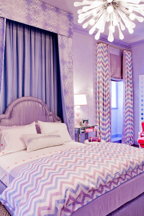
3) Your Daughter's Room : Chances are your little gal has a "Purple" phase going on - what with their Princess/Barbie love (Not stereotyping or gender segregating - take it just as a suggestion!!).
4) Introduce an Accent Color : Mixing this bold hue with another color can accordingly balance or embolden the look of a room. For an added dash of pop, mix it with Yellow, for a harmonious color balance, play with Grey or Taupe and to add a dash of luxury, mix a little Gold and your home is fit for royalty!!
With Yellow/Mustard -
With Grey -
With Taupe -
With Gold -
5) Go Bold!! : Can you commit for the longer haul with this color?? Then splash it on your walls for the world to see. Make this color the focal and the talking point of your room. If you love this color and have the confidence, then why not?
As per your taste and decor-confidence, add these updates for an entirely new and trendy look for your home. For any doubt, just ask us in the comment section or shoot us a mail at housefliesanonymous@gmail.com. Until next time, happy decorating, xoxo.


No comments:
Post a Comment